Incorporating Visual Elements into Social Media Survey Questions
When designing social media surveys, it’s essential to integrate visual elements that resonate with respondents. The usage of images, icons, and infographics can significantly enhance participant engagement. Visual aids not only break the monotony of text but also help in conveying complex ideas clearly. When asking questions, consider utilizing appealing graphics that illustrate key concepts or scenarios. This can encourage users to provide more thoughtful responses. Balancing text with visuals maintains the attention of your audience, making them more likely to complete the survey. Providing various formats, such as checkboxes alongside representative images, can also facilitate quick cognition. Moreover, clear visual prompts can guide participants through intricate topics, ensuring they don’t feel overwhelmed. This is particularly crucial in a digital environment, where attention spans are shorter. By leveraging visual storytelling, you can effectively communicate the purpose and nature of the survey. Incorporate user-friendly designs to foster inclusivity, accommodating diverse audience preferences. This approach ultimately leads to higher response rates and more accurate data, essential for effective analysis and decision-making.
Integrating elements like charts or sliders into your survey can provide respondents with an interactive experience. A well-crafted visual representation of data may prompt deeper considerations from participants, leading them to elaborate on their answers. Moreover, embedding video explanations can also enhance understanding. Visual content helps reduce cognitive load, making it easier for respondents to grasp various questions. For instance, using a video can clarify complex survey elements that text alone may struggle to convey. This format could be particularly effective for topics requiring thorough explanation or context. Using visuals can not only clarify but also simplify the survey-taking process. Consider providing a clear visual context to create a more engaging atmosphere. Designing your questions with visuals can spark curiosity and encourage users to go beyond surface-level answers. This results in collecting quality and meaningful data. Keep in mind that the visuals must align with the survey’s purpose effectively. Cohesive and relevant visuals are critical, ensuring they complement and not confuse your main message. Suitable visuals can cater to various demographic preferences as well, thus broadening the reach of your survey.
Types of Visuals to Use
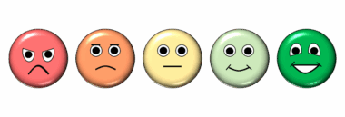
Choosing the right type of visual element for your survey questions can significantly impact user experience and data quality. Consider using icons alongside questions to represent response options creatively. For example, using emoji reactions can provide a light-hearted approach while gauging user sentiments. This method can make the survey feel more relatable and less formal. Alternatively, infographics can effectively communicate background information relevant to the questions being asked. Such visuals are invaluable for promoting understanding before diving into the actual questions. Another useful strategy involves employing visual Rating Scales, such as stars or faces, allowing users to express agreement or satisfaction visually. Additionally, embedding charts to summarize critical statistics could also enhance respondents’ familiarity with the subject. This familiarity can lead to better-informed responses. Visual questions can additionally facilitate quicker decision-making, reducing the time spent on each query. As a result, this approach makes the overall survey experience efficient and enjoyable. Finally, ensure the visuals are accessible and optimized for all devices. A mobile-responsive design guarantees optimal participation from users on various platforms and enhances survey reach.
Testing the visual elements of your survey is equally important to ensure effectiveness and clarity. Before launching the survey, gather a small sample of users to evaluate the visual components. Encourage this test group to provide constructive feedback on the visuals used. Assess whether the visuals were engaging and facilitated understanding of the questions. Adjustments based on this feedback can lead to significant improvements in survey clarity. Furthermore, it’s essential to keep in mind that different demographics may respond uniquely to particular visual formats. This means testing should include diverse participant backgrounds. By doing so, you can ensure that your visuals resonate with a broader audience. Pay attention to colors, as they can evoke specific emotions and reactions. Avoid overly vibrant colors that may distract from the content. Instead, choose a color palette that aligns with your brand identity while remaining soothing for the eye. High-quality images should be selected, as they contribute to perceived professionalism and reliability. This professionalism can help build trust with respondents, making them more likely to share honest insights. Constantly iterating on feedback will enhance your survey design significantly.
Maintaining Consistency in Visual Design
Maintaining consistency in visual design throughout your survey is crucial for ensuring a cohesive user experience. Every visual component should complement the overall survey ethos, from color schemes to font choices. Consistency can aid in creating brand recognition and trust among respondents. When they notice familiar design patterns, users may feel more comfortable providing feedback. Additionally, it’s important to align the visuals with the survey’s context and audience expectations. Avoid overwhelming users with too many visual elements in a single question; this could lead to confusion and disengagement. Instead, utilize whitespace effectively to create a balanced layout, allowing visuals to stand out without overpowering the text. Proper spacing ensures that respondents can process information easily. Furthermore, ensure that all icons, imagery, and graphics are relevant to the questions and contribute to their clarity. Designing with readability in mind is crucial; avoid small text on visuals, which may strain users. Use straightforward, easily recognizable visuals that lead to quick understanding. Ultimately, polished designs that prioritize user experience will yield more meaningful and accurate survey data.
Communicating your findings effectively is another vital aspect of incorporating visuals into social media survey questions. After collecting the data, utilize graphs and charts to present results attractively and understandably. By illustrating your findings, you can convey insights clearly, helping stakeholders grasp critical information at a glance. Visual summaries allow for quick interpretation of complex data, making it more digestible. This practice not only enhances transparency but also fosters engagement with the information obtained. Engaging visuals can create an emotional response, prompting stakeholders to take action based on the insights provided. Infographics summarizing the results can capture audience attention, stimulating discussions or further inquiries. Consider sharing these visual outputs across social platforms to reach a wider audience. Visuals encourage sharing, thus amplifying the impact of your survey results. When presenting your findings, ensure that visuals used align with your brand identity for consistency. This allows the audience to connect the data back to you and invokes trust. Visual storytelling can do wonders in conveying your research narrative; effectively showcasing your brand’s journey through the data collected from social media surveys.
Final Thoughts on Visual Elements in Surveys
In conclusion, integrating visual elements into social media survey questions can be transformative. By thoughtfully incorporating images, icons, and other visuals, you can enhance engagement and improve data quality. The strategy not only captures attention but also aids understanding, ultimately leading to more thoughtful responses. Ensure that the visuals are relevant and maintain brand consistency throughout the survey to foster recognition and trust among respondents. As demographics may vary in preference for visuals, a testing phase is essential to idealize the design before launch. Use feedback from pilot groups to tweak and refine your visuals. Remember to communicate your findings effectively using attractive visuals that simplify complex data for your audience. Ultimately, a well-executed visual strategy can lead to higher completion rates and valuable insights. While spreadsheets filled with data are essential, they can never replace the impact of compelling visual storytelling. Investing time and effort into designing your survey with visuals can yield significant returns in the form of user engagement and actionable insights. Embrace creativity and innovation, and the results of your surveys can exceed your expectations.
In summary, the transformation of social media surveys through visual elements is a pivotal step towards better data collection. It enriches the experience for respondents and ensures that the feedback garnered is both meaningful and beneficial for analysis.